We all love a good map, especially one that tells us something we didn't already know about the city we live in. So there were squeals of joy at Londonist HQ as we explored London Mapper.
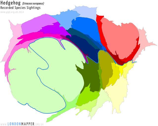
The site calls itself a "social atlas of London" and was set up by Danny Dorling, whose book All That is Solid is a fantastic outline of how inequality is screwing the housing market, and Benjamin Hennig at the University of Oxford. It's launched with 300 maps that draw on publicly available datasets, displaying them in a way that makes the cold, hard figures more accessible. For example, there's a map showing how much the value of housing sold increased in each borough between 2012-13; how income deprivation has changed, by ward, between 2007-2010; the numbers of rough sleepers by borough in autumn 2013; and where London's hedgehogs live (mainly Kingston-upon-Thames and Redbridge, by the looks of it).
Where maps are split by borough, the boroughs always have the same colour — it's the size that changes according to the data. You can also choose to see a reference map, which displays boroughs sized by their actual populations, and sometimes maps are available by ward and with extra information in a grid map. The original data is always available to download, either as an Excel spreadsheet or an interactive display (available soon). If you want more information, they've put together a handy guide to using the maps.
If you'd prefer not to wade through the data yourself, click the Analysis menu. Here, Dorling and Hennig plan to write one in-depth analysis each month. The inequality introduction is fascinating but if you want to see some weird maps we recommend the demography article. There are also shorter, snappier pieces on the site's blog.