Join us to chat about all things related to London transport on our new Facebook group, Londonist Roundel Ramblings — everyone welcome.
Naureen House? Jumpperly? Great Puddington? Hold your horses — what's going on here then?
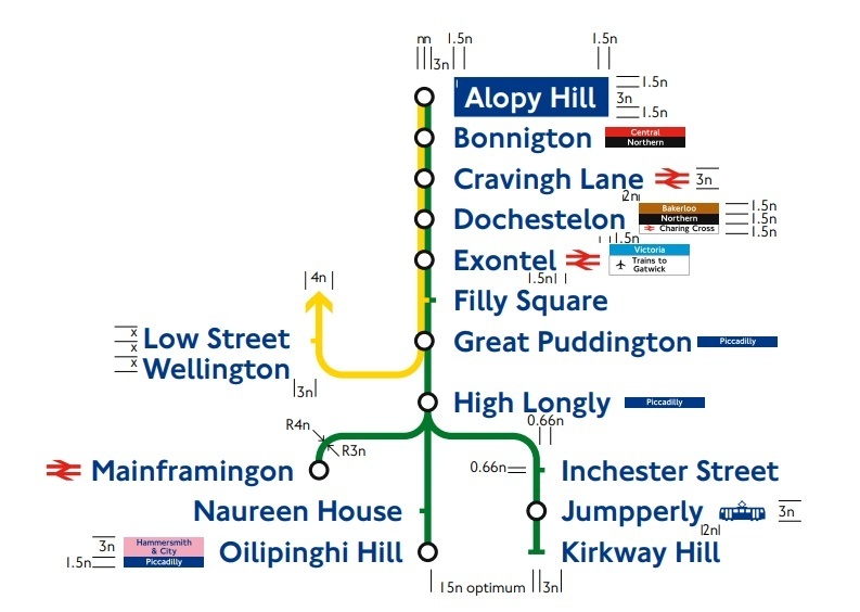
Alternative tube maps might be ten a penny, but far less so when they're created by TfL. Nonetheless, this diagram of a make-believe District and Circle line is as official as they come.
The diagram — which most recently surfaced on Reddit — lays out TfL's strict design rules for the vertical platform line diagrams, which we're all familiar with. Someone's had some fun, creating stops such as Mainframingon, Oilipinghi Hill and Bonnigton — none of which exactly roll off the tongue.
Between them, these bizarre station names cover all letters of the alphabet — aside from Z. (And yup, there is a real station with a Z in it — Belsize Park.)
Some of the Reddit comments were more extraordinary than the station names themselves, one of them reading:
Great puddington sounds like a stage name for a massive cocked teddy bear in a rain coat
You'll find this singular diagram nestled away in TfL's comprehensive house style guide [pdf]: an aesthetic bible, which denotes the layout of signage down to a gnat's whisker.