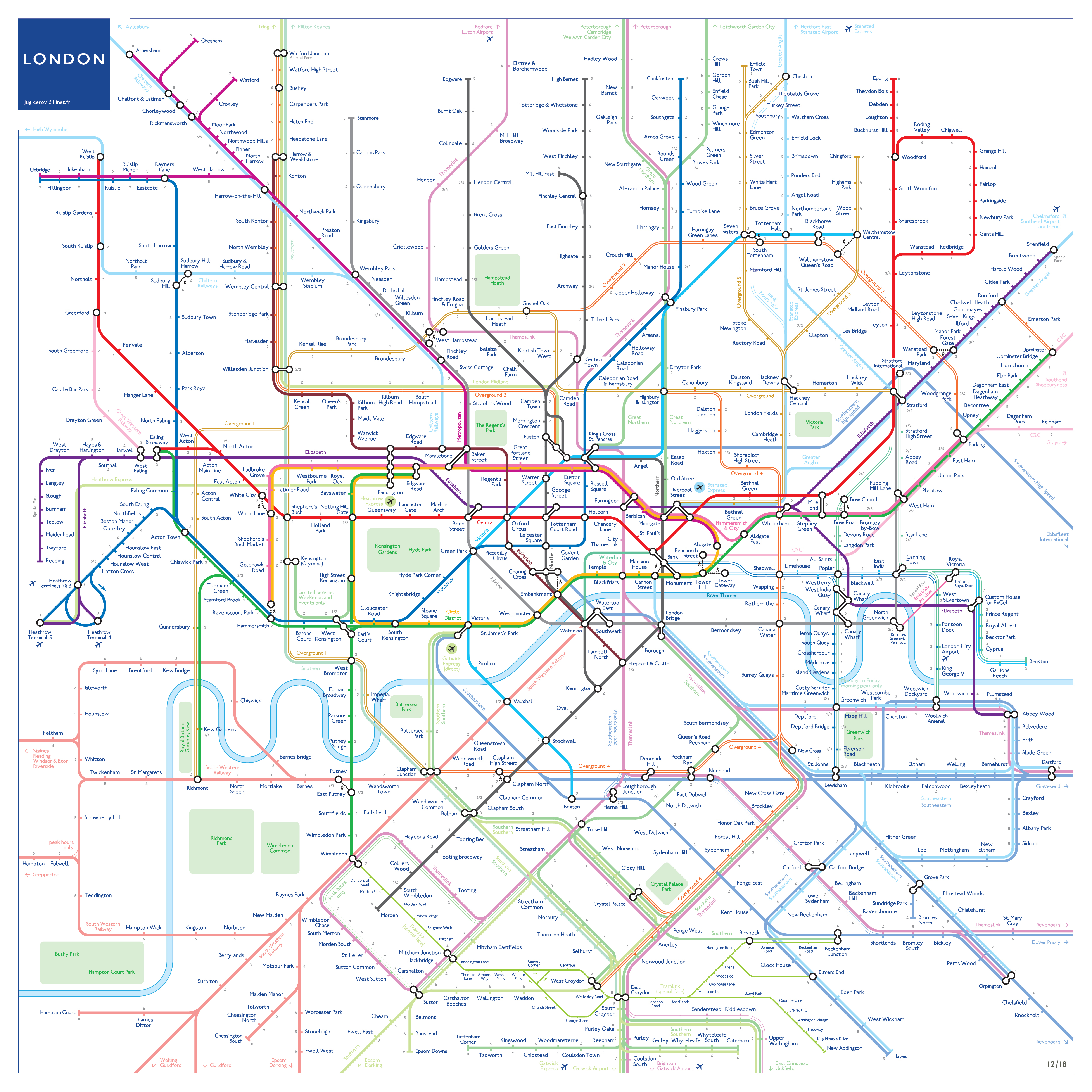
The Jubilee line. The Overground. Crossrail*. A lot has happened to London's rail network since electrical draughtsman Harry Beck's revolutionary London Underground map was first published in 1931.
The map itself has gone through countless design changes and tweaks in the past 85-odd years. Blobs became diamonds became blobs again. The Thames evaporated then reappeared. An increasing spaghetti of lines emerged. And while today's tube map helps millions navigate the network daily, there will always be those who think they can make a better fist of it.
Enter Jug Cerovic. He's taken today's tube map, and combined it with design aspects form Beck's original. Let's take a closer look.
1. Grey zone areas are gone, creating a cleaner canvas

Instead, the zones are noted along the edges of the line. The lines are also name-checked as they meander through the map, rather than appearing in the key. Neater, or not?
2. The Elizabeth line is on the map
It'll be included on TfL's official tube map too. But Cerovic's rendering of the purple line is less, well, kinky.
3. The Thames appears with glorious bends

The Elizabeth line may appear straight as a die, but Cerovic gives the Thames some marvellous serpentine swooshes — and throws in major parks, for easier navigation. It's arty. It's practical. We like it a lot.
4. Major rail lines are included

Sweeping into London at majestic 45-degree angles (as do all the lines on this map, albeit with sexy Beckesque curves). These rail routes are colour-coded according to their central London terminus, e.g. Southeastern to Charing Cross: dark blue; Southeastern to Cannon Street: light blue. This is Cerovic's answer to his frustration of the tube map excluding non-TfL routes.
5. The DLR is colour coded according to its route

The same rule is also applied to the London Overground lines, which in Cerovic's map, form an orbital network around central London. Whether this kind of colour coding lessens or compounds confusion is subjective.
So then - what do you think? Comments below please. And check out more details of the map here.
*Actually Crossrail hasn't happened yet but that's by the by.