The tube map is a London icon. Technically it’s not really a map but a diagram, as it doesn’t reflect the real geography of London at all accurately — but its clear, colour-coded lines and friendly curves shape the way most of us visualise the capital.
The map wasn’t always so accessible. As the independent railways of the 1800s merged into a single system, the first map, published in 1908, looked like this:
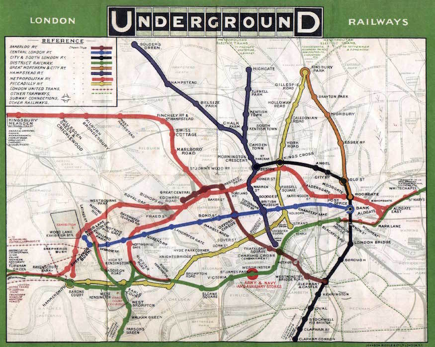
It was, self-evidently, a mess. The map showed all the important central stations (including several that have since closed down or changed names), but it didn’t make it easy to find your way around. Station names had to be written in small text, often at odd angles so they could be crammed in between awkwardly twisting lines.
The map also omitted stations further out from the centre, for reasons which become obvious when you look at a later map that tried to show more of the network:

As you 'zoom out' from the centre of London, you end up with a huge amount of wasted space toward the edges, and an illegible crush in the middle.
In 1926, a map-maker named Fred Stingemore set out to improve matters by regularising the spacing between stations, and allowing himself some artistic licence with the routes of the various lines. The result was a map that no longer represented the true shape of London — and thus couldn’t be superimposed on a street map, as earlier attempts had been — but did allow more stations to be represented with larger text:
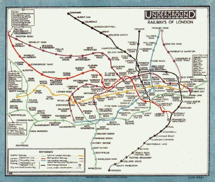
Not only was the new map neater, it arguably had a social function. It showed outlying stations such as Edgware and Richmond appearing to be only a short distance from the centre of town, promoting a sense of community between inner London and the suburbs. Even then, Stingemore wasn’t able to fit in the furthest reaches of the tube system: the Bakerloo, Metropolitan and District lines are all cut off at the edges of the map.
The modern tube diagram
Stingemore’s work was clever, but its impact was far from earth-shattering: the Underground Electric Railways Company of London (UERL), which operated the tube, continued to publish large geographical maps alongside handy pocket-sized copies of his diagram.
The man who created the tube map we know today was Harry Beck. Formerly an engineering draughtsman for UERL, he lost his job with the Underground in the late 1920s as a result of funding cuts. But he retained an interest in London’s transport system, and with time on his hands, set about on a project to "tidy up" the tube map by — as he would later recall — "straightening the lines, experimenting with diagonals and evening out the distance between stations".
In 1931, he finished drawing his first tube map based on these principles:

There are plenty of differences between Beck’s first effort and the map we know today. Station names are all in capitals, as was customary at the time, every station is marked with a 'blob', and interchanges are shown with multiple circles. All the same, much more of the network is represented, and the spirit of the modern map is detectable.
Although Beck’s map had been entirely a personal endeavour, he was encouraged by friends to send it in to UERL for consideration.
The company, in its wisdom, promptly returned it, explaining that it was not interested in such a "revolutionary" map.
But Beck didn’t give up: the following year he tried again, and this time the company agreed to buy the design off him for just over £10 — equivalent to around £600 today.
In the process of preparing the map for publication, a few adjustments were made: stations without interchanges were now shown with 'ticks' instead of blobs, and the handwritten type evolved to something very similar to the font used today. Interchanges, for some reason, became diamond-shaped. The result, published in 1933, is instantly familiar:
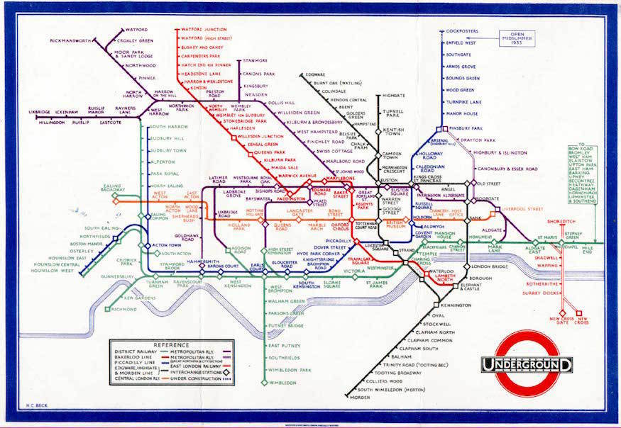
Originally distributed as a folding pocket-card, the first Beck map came with a slightly cautious explanation on the front: “A new design for an old map. We should welcome your comments.”
In the event, Beck’s map was a clear hit: the original print run of 750,000 was snapped up in a month, requiring a further 100,000 to be printed almost immediately.
Tweaks and interference
As it stood, Beck’s tube map needed no improvement, but refinements were continually being worked in, many of them still with us today.
By August 1933, the diamond-shaped interchanges were back to the neater rings of Beck’s original design (though they were still coloured rather than black). The following year, the colour scheme was updated, giving the Bakerloo and Central lines their now-standard red and brown hues.
There were also plenty of missteps along the way, most of them not Beck’s fault. For example, in 1935, the UERL board demanded an update to the map that would use bold lines for stations within the central area, and much larger symbols for interchanges. Beck did his best to comply, but the result was not a thing of beauty:
The experiment was fairly short-lived, and the diamonds were ditched in 1937. But this wasn’t the end of the board’s meddling.
In 1940, Beck was asked to create a version of the map with linked rings for interchanges — an idea that someone presumably thought would be a strong symbol, without considering how it would actually look on the page:

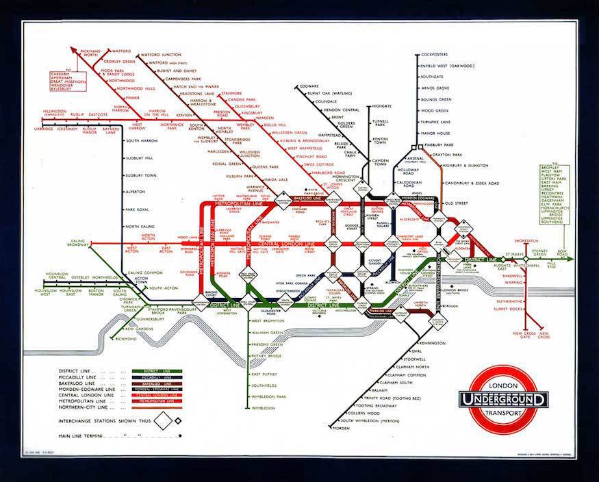
This version of the map also has an uncomfortably slanted feel, arising from the need to squeeze in a lengthy eastward extension to the Central line. Beck didn’t love this: subsequent maps returned to 45° angles, and made much greater use of verticals. His own vision can be seen in this map from 1949, which he later identified as one of his favourite iterations of the diagram:

After Beck
Probably the biggest misstep in the history of the tube map came in 1960. For the first time in nearly 30 years, London Transport (as UERL had by now become) created a new version of Beck’s map, updated to show the new Victoria line, without consulting him.
Credited to publicity officer Harold Hutchison, the map didn’t just add a new line but also introduced ugly sharp angles and square interchanges:

Beck was understandably disappointed by what had become of his design — and angered at the infringement of his copyright.
He wrote numerous letters to the management, but was repeatedly fobbed off. "I am not aware of any undertaking by my predecessors," insisted Hutchison. Eventually Beck gave up and abandoned his relationship with London Transport, although not before submitting his own idea of how the Victoria line might be represented:

Beck might take some satisfaction from the fact that Hutchison’s map was not widely admired, and in 1962 another London Transport employee named Paul Garbutt stepped in to fix it. He brought back the feel of Beck’s work, but kept some of the positive aspects of Hutchison’s map, including black rings for interchanges and lower-case text for non-interchange stations. Garbutt can also be credited with the familiar 'bottle' shape of the Circle line:
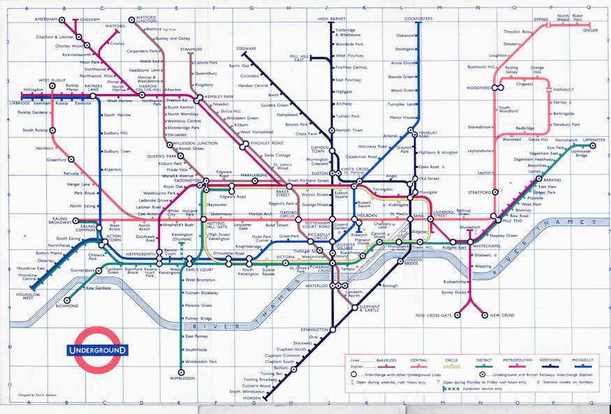
Almost all the features of the modern map can be see here, and a short process of evolution leads to the diagram we know today.
In 1981, the tube switched from per-station pricing to the simpler system of zones, and most maps now show the zonal boundaries. Dark blue “wheelchair” circles have been added to show stations with step-free access.
Perhaps the biggest change has been the addition of extra services. The Jubilee line opened in 1979, with a major extension completed in 1999, bringing the map towards its current total of 270 tube stations. 112 London Overground stations are shown too, along with 45 DLR stations. Add in tram and riverboat services, along with the forthcoming Elizabeth line and that’s around twice as many stations and connections as Harry Beck tried to cram into his first tube map:

So if you’re ever bamboozled by the complexity of today’s map, remember that it presents a phenomenal amount of information — and think how utterly incomprehensible it would all be in the hands of one of the network’s early map designers. Harry Beck died in 1974, but his pioneering work in making sense of our city lives on.