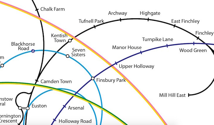
Back in 2o11, Francisco Dans coame up with a take on the Tube map that makes up for in abstract beauty what it lacks in practicality. His curvilicious design takes Frank Pick's rectilinear, geographical classic and spirals it out from the most densely connected station (King's Cross St Pancras) to the furthest-flung parts of the map (at least that's what we think he's done).
We particularly like the blocky roundel (or "oblongel", perhaps) that replaces the more familiar logo.

In its current guise the map features only the Tube lines, but Francisco is working on adding the DLR and London Overground too. More power to him.

Hat tip: IanVisits