Geographically accurate tube maps are nothing new — in fact. TfL has previously released its own one into the wild.
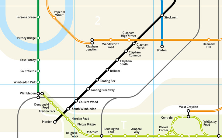
What designer Mark Noad has done is a little different: his latest tube map is still heavily inspired by Harry Beck's circuit diagram-esque map. But look closer and you'll notice that stations are positioned so they are more geographically accurate in relation to one other.
See, for example, in the lead image, how the Central line starts sloping downward from Marble Arch to Lancaster Gate and Queensway — whereas on the official map, a straight line is retained all the way to Ealing Broadway.

Says Noad: "It is intended to help people, particularly those unfamiliar with the city, to relate the underground
system to London at street level."

Noad previously released one of these maps in 2011, but this latest edition anticipates the Northern line extension and the Elizabeth line.

The overall result is a more serpentine, spaghetti-like tussle of lines. As Noad says, it'll perhaps be more useful to London newbies navigating the city. But we reckon a few purists might have some beef with the layout. Here's the map in full:

Learn more about the map here.
All images © Mark Noad