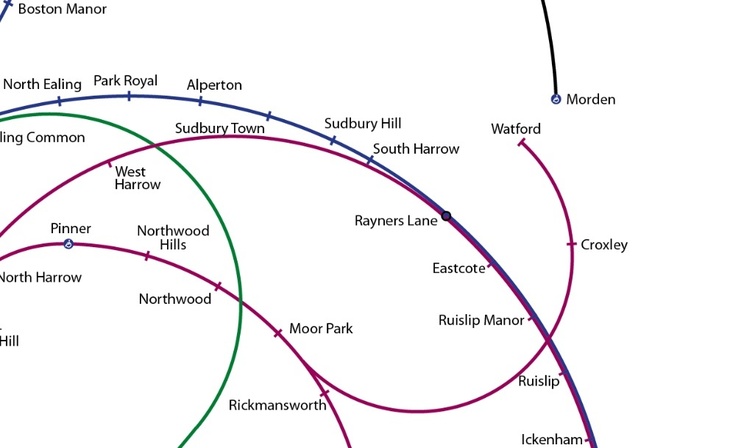
It's the tube map, but not as you know it.

Francisco Dans' take is a swirly spaghetti of tube lines — beautiful, and yet quite befuddling to behold.
There is method to the madness, however — the stations appear to spiral outwards, from the most densely connected station (King's Cross St Pancras), to the furthest reaches of the network.

This creates the rather disorienting phenomenon on Watford neighbouring with Morden, and West Ruislip neighbouring with Epping.
Still, you can technically use the map to get around. Next time a tourist asks for directions, try pulling out one of these babies.
Oh, and top marks for that unround roundel.


The map features in our book, Londonist Mapped, available now in hardcover, for just £11.89.


