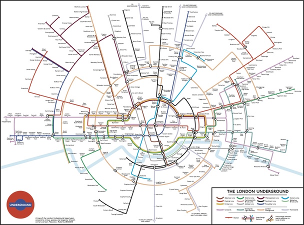
Last week, Jonathan Fisher sent us a reworked Tube map, which presented the network as a series of concentric circles. Max Roberts, a long-time experimenter with the Tube map and author of Underground Maps Unravelled, has pushed the design further, increasing the number of concentric sections and — most pleasingly — spacing out the central section to resemble the famous Tube roundel. Note also that the map includes the Thameslink line and the forthcoming Crossrail — both of which are absent from TfL's standard Tube map.
As Max explains over on Annie Mole's blog, this is intended purely as a bit of fun, to see how resilient the map is to such tamperings. "I don't think I will be sending this one to TfL for comments," he says. "No great advances in usability here, but it was fun to make it."


