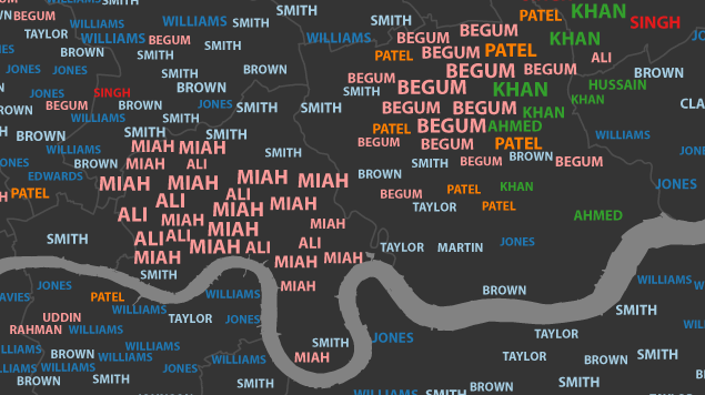
As feats of data visualisation go, they don't come much more compelling than this. James Cheshire (@spatialanalysis) has built a map of London's commonest surnames by area, using data from the 2001 electoral register. The map contains 2379 individual surnames represented some 15,000 times.
Names are colour coded according to origin. Among a blue tide of British appellations (Smith, Brown, Williams, Jones) patches of pink can be found in Tower Hamlets to show the large Bangladeshi population (where Begum, Miah and Ali dominate). Large sections in orange, over to the north-west and near-east, denote Indian origins, exemplified by the name Patel. Meanwhile marked clusters of Pakistani names can be found in the southern areas of Waltham Forest and Lambeth boroughs.
Sample sizes are represented by font heights, and a sliding bar lets you drill down to second-most-common names and beyond.
Impressive work. We'd love to see this running with historical data, showing how the capital's surnames have changed over the decades, and potentially over the last two centuries if census data could be incorporated.
You can find further insights and more detailed analysis over on James' research blog, Spatial Analysis.


