Pantone 266c: you may not think you know it, but you do. It's this:

Still not ringing a bell? How about this then:

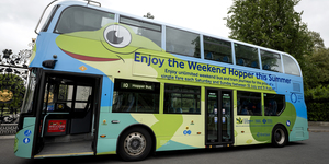
TfL is a stickler when it comes to branding, and when Crossrail makes its butterfly-like transformation into the Elizabeth line, your eyes will find it hard to escape the vivid hues of Pantone 266c — sloshed liberally over roundels, signage, even moquette.

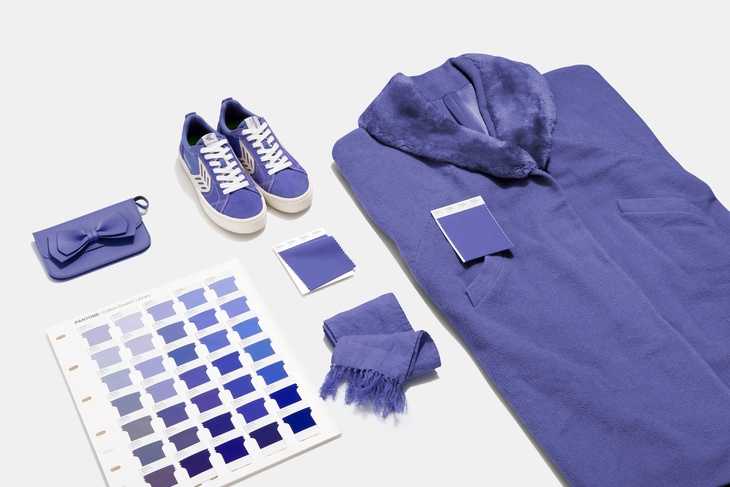
And, on the year that the Elizabeth line finally opens (well, it had better do), is it coincidence that the 'Colour of the Year' is this one:

Actually, yes — yes it is.
Pantone 17-3938 (aka 'Very Peri' — short for periwinkle, it's got nothing to do with Portuguese chicken) may appear similar to Elizabeth Line Purple, but TfL didn't work in cahoots with Pantone on the branding. In fact, Pantone told Londonist: "Most than likely, the fact that they selected a purple tone similar to Very Peri is a coincidence."
Elizabeth Line Purple is more likely to have been chosen because a) TfL had basically run out of colours to use on the tube map and b) purple is a historically regal colour, therefore fitting to the woman lending the Elizabeth line her name:

Very Peri, on the other hand, was chosen by Pantone because it (deep breath): "helps us to embrace this altered landscape of possibilities, opening us up to a new vision as we rewrite our lives. Rekindling gratitude for some of the qualities that blue represents complemented by a new perspective that resonates today... [placing] the future ahead in a new light."
So there you go. Oh wait, they're not finished. It's also:
"A symbol of the global zeitgeist of the moment and the transition we are going through. As we emerge from an intense period of isolation, our notions and standards are changing, and our physical and digital lives have merged in new ways. Digital design helps us to stretch the limits of reality, opening the door to a dynamic virtual world where we can explore and create new colour possibilities."
And, as we say, TfL probably chose purple because there weren't any others left. Both valid reasons tbf.
The million dollar question: will these vivid shades of purple be on everyone's living room walls/socks/Pantone mugs? Well, probably yes.
Pantone's 'Colour of the Year' is an annual announcement/self-fulfilling prophecy that's taken pretty seriously by the world of fashionistas; names like Botter, Swarovski and Hervé Léger are already flaunting Very Peri designs:

TfL itself has become an unlikely fashion icon, flogging everything from moquette socks to armchairs and, briefly in 2018, trainers. When the line actually opens, just think of the sales — enough to claw back £19 billion maybe?
Although we don't really do fashion here at Londonist, we're putting our necks on the line. Between them, Pantone 266c and Pantone 17-3938 will cause a sweeping inclination towards purple, the likes of which hasn't been witnessed since 1857, when Empress Eugénie went out in a purple dress and everyone went nuts for it.
Oh, did we mention that the colour purple was (sort of) invented in London? Well that's a whole other story.