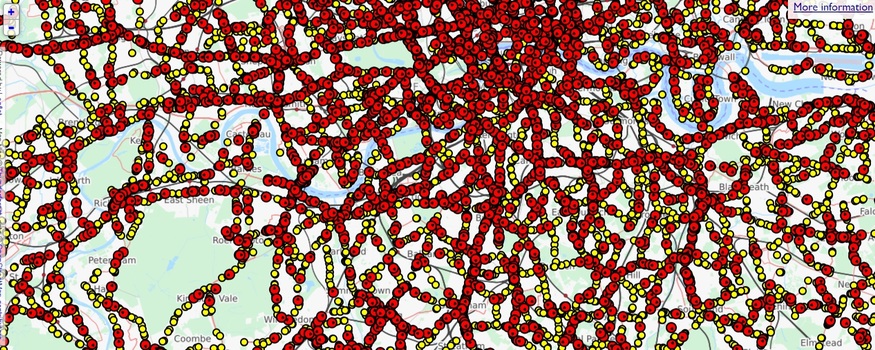
If you were a god fixated on road-based public transport, then your view of the capital might look a little like this.

It is a map of London showing every bus stop (yellow) along with every single bus... in real time. Play with it here.
And what a tangled web it is. The map, put together by Matthew Somerville, draws on the publicly available bus-countdown data from TfL — thee same data that feeds the LED screens at bus stops and the app in your pocket.
With 19,500 stops in London and over 8,000 buses, that's a lot of data to juggle. Consequently, you need a decent internet connection for a smooth experience.
Happily, you can drill down to individual bus routes. This might be handy. You can see at a glance if upcoming buses are bunching together or spread out. On this screengrab for the 55 route, for example, we can see that two buses are ganging together at Hatton Garden. Maybe jump on the second rather than the first.

The site isn't the most user-friendly experience, but it is remarkably addictive to watch those red blobs pootle about like ants. It's been around since 2013 (when we initially linked it up), but reader Lane Roberts recently reminded us of its geeky allure.


