
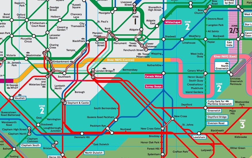
Take a look at the tube map above. A wash of bold background colours, squiggly lines and matching tube lines, it's all a bit of a mess. Where do we even begin with this one?
This is called a PAYG Map (Pay As You Go map). It shows all the fare information TfL staff need to understand the network. Take a look at the full thing.
This map isn't meant for public consumption, it took a Freedom of Information request from one Tim Dunning to prise it out of TfL's secret map cupboard.

So what does it all mean? Well, the green lines charge tube fares, the blue lines charge other TfL fares, whereas the red lines charge the expensive National Rail fares. Then there's those squiggly lines between stations. They're for the Out of Station Interchanges, the bits where you can walk between stations without having to pay for leaving and rejoining the network. Here's a full list of them.
Also worth noting is the magnificent colouring job that's been done on the river, to signify which fare zone you're in. Finally a few stations are highlighted in pink. That means there's a pink Oyster card reader at the station, and we've done a quick explainer on them here.

For most of us, this map doesn't have much practical use, apart from for gazing at while inhaling its incandescent beauty. Oh and for spotting mistakes and typos, of which there are a few — for starters, Dunning pointed out in his FOI that Swanley is in the wrong zone.
We leave this map with you, to entertain yourself endlessly. If you do spot any more more errors, tell us about them in the comments below.
Thanks to our dear friend Deej for pointing this one out.


