

To the trains. Priority Seat. Stand on the left: Londoners may not like to think they do what they're told, yet we take heed of London Underground signage like god-fearing children at Sunday School.
In the early 1900s there was no official font for the London Underground; the service was a typographical Wild West where serif and sans-serif tussled for the attention of commuters. The sprawling network was crying out for a voice that straddled authoritative and pally; the network needed a universal font.
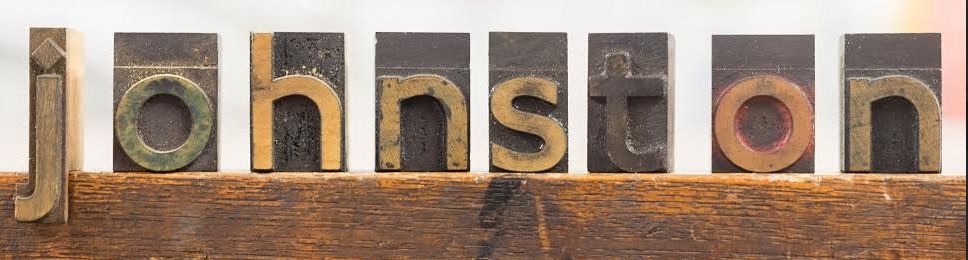
Enter Edward Johnston, a Uruguayan-born Scot who was a teacher of calligraphy and scholar of medieval manuscripts, and was about to create London's — and probably the world's — most famous font, Underground. Later on, it would be renamed after the man himself, simply: Johnston.
But the font could have ended up as Johnston-Gill. Frank Pick, commercial manager of the London Electric Railway Company, wanted Eric Gill — he of BBC Penisgate notoriety — to work with Johnston on the project. Gill, though, was otherwise engaged on some reliefs at Westminster Cathedral.
With his adoration for the middle ages, explains Donna Steele, curator of a new exhibition about the font at Ditchling Museum of Art + Craft, Edward Johnston was not an obvious choice for the network's plan to modernise. But, inspired by his friend Gerard Meynell, owner of Westminster Press (whose main client also happened to be London Underground) Johnston agreed to give it a stab.
"Meynell was a dynamic and astute man... and good at encouraging Johnston to try new things," says Steele.
In fact the font — created between 1913-1916 — is a coming together of the classic and the contemporary: it takes the bold, booming Roman square capitals, then lightens the mood with its friendly sans-serif sensibility. Johnston had a knack for humanising things; he also redesigned the roundel, hollowing out the angry solid red disc and giving us the ring doughnut we all love.

In 1979 Johnston was given a modern touch-up courtesy of Eiichi Kono, who made the font family more versatile, for instance, adding an italic option. The calligraphic tittles above the i and and j were not only kept, but extended to punctuation too. Rolled out in 1983, Johnston New has remained the same since, used on everything from signage for the 2012 Games to the overlays in the BBC's Sherlock series. As square capitals were the font of ancient Rome, so Johnston is the font for modern London.
Johnston, who died in 1944, got to enjoy the fame of his font in his lifetime, once writing: "I claim no particular merit in myself but — historically — it happens that I have been the pioneer in three* rather simple and, indeed, rather obvious, ideas, which — technically — have become of some importance."
Humble words indeed from a man who continues to tell millions of Londoners what to do and where to go every single day. If you seek his memorial, you can find it all around you. Or you can visit the plaque on his former house on Hammersmith Terrace. The words, of course, are inscribed with Johnston.
London Transport Museum is running a number of events to coincide with the 100th anniversary of Johnston Underground as part of Transported by Design.
Ditchling Museum of Art + Craft's exhibition Underground: 100 years of Edward Johnston’s lettering for London runs from 12 March-11 September. The museum is in the South Downs, so not something you can nip to in your lunch hour.
*The other two ideas were teaching the first classes in formal penmanship and lettering, and studying the pen shapes of letters in early manuscripts at the British Museum.


